Comet Coffee
This is an individual project where I redesigned the website of a local coffee shop. I focused on enhancing digital engagement while preserving the authentic in-store experience and personal human interaction that defines the brand.
Role
UX Researcher & UX Designer
Time
August 2025 - March 2025
Tools
Figma
“All human interactions are opportunities either to learn or to teach.”
—M. Scott Peck
What’s The Problem?
Comet Coffee is a local coffee shop where the baristas know customers by name (and order) in an intimate setting. They thrive on human connection and have “no tech” spaces. This translates into their website design with minimal information, no coffee, and no consistency between merchandise sold in-store and online. How might we create a cohesive online experience that informs users about Comet Coffee’s drinks, merchandise, and beans available for pickup or delivery, while preserving the shop’s intimacy and “no-tech” charm?
My Solution
Here is a peek to the Figma file of the final prototype. Or scroll along here to see the design process and final prototype at the end!
Research
Current Website
Heuristic Evaluation
Clarity and Real-World Alignment
Jargon is simple and easy to understand, matching user expectations.
Navigation, Control, and Error Prevention
Users can easily navigate between pages, edit or remove cart items, and recover from small mistakes.
Few opportunities for error beyond selecting or adjusting the wrong item.
Consistency and Minimalist Design
The interface is highly consistent and minimalist, but lacks visual appeal and warmth.
Product options are inconsistent in-person vs online and photos feel amateur in a way that does not inspire purchases.
Recognition Over Recall
Limited interactive elements make the site simple and intuitive to use.
Understanding the user
Observation + Quick Intercept Interviews
I observed customers as they sat and interacted with each other or worked solitarily, as well as the baristas as they took orders, made drinks, cleaned and acted in their downtime. I also observed the environment— the building, furniture, decorations, etc. Lastly, I spoke to a neighboring customer and got his take as a regular patron of the cafe.
Understanding the business
Stakeholder Interview with a barista + Product Vision Board
Observations + Insights
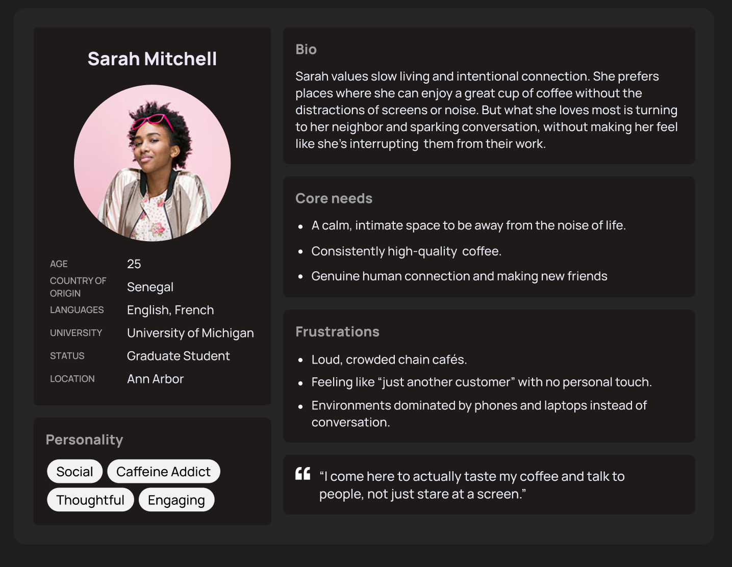
User Persona
Design Process
Design System + Accessibility
Design Decisions
Comet Coffee is a space created to unplug from technology and reconnect with the people around you. I redesigned the website in a way that would stay true to the core of Comet Coffee.
-
While observing the interactions between customers and baristas, I noticed a strong sense of familiarity; most customers were greeted by name, and some didn’t even need to state their order. The baristas recognized them upon arrival and began preparing their drinks immediately. I aimed to replicate that warm, personalized experience within the website, ensuring that customers feel welcomed and understood as they place their orders, just like in the cafe.
-
Just as I observed the ease in which baristas connected with the customers, I also noticed the familiarity in the way the customers asked about the lives of the Comet Coffee employees.
-
Comet Coffee is all about slowing down and being in the moment, so it was an easy choice to remove the option of “Skip the line. Order Online”.
Evolution of Initial Designs
High Fidelity Designs
User Testing
After creating my initial HiFi designs and executing some prototyping, I turned to usertesting.com for usability test and a comparison between the live website and my redesign. Then created an affinity diagram based on the feedback I received to help guide in my iterations. As I worked on incorporating the feedback, I kept a detailed log of the design changes I made.


